


SUBSCRIBE
Get on the list and let’s become friends. Join our community of like minded women, and get all my latest recipes, finds and personal stories. I’m so happy you’re here.
Choosing the right white paint
Choosing the right “white” paint for your space can be harder than one might think. There are so many nuances that come with white paint.
When we were moving into our new home, I knew that I wanted to paint every square inch of our house. I wanted to be intentional with the color palette, and make our entire home feel cohesive. So choosing the “right” color was really important. I knew we would land somewhere in the “white” family, but I just wasn’t sure where.
My kids always laugh that I “love white”. And I do. It’s for sure my favorite color. And here’s why…
It makes every other color that much more gorgeous. Pinks pop. Blues feel cooler and more tranquil. Even black looks gorgeous against this hue.
But choosing the “right” white paint for your space is tricky. Scratch that. It can feel impossible.
We’ve used white a lot in our homes. In fact, three of our last homes were painted entirely white (I know…I have a problem). But each time, I used a different white. And here’s why. Each home had different colored flooring, different lighting, different architectural details. And all of that matters.
Here’s what we learned to consider before picking out the “right white”.
-
Light
- How much light does the space get, and what type of sun exposure are you working with? A northern exposure (which tends to be a “cooler” light) needs a warmer or softer white paint color to balance out the cool tones of the natural light. While a room with a lot of southern or western exposure can often handle a cooler white tone. And a larger, airier space with a light of natural light also often works best with pure, cooler tones of white.
-
Your decor
- Size up what else is going in the space. What you fill the room WITH, is just as important with what color SURROUNDS the space. If your furniture and decor are more modern and have cooler tones, you can work with a crisper cooler tone. If your decor and furniture tend to be a little more traditional, then something with a warmer undertone will compliment the space better.
-
Floor
- What are your floors like? Are they a warm wood a cool carpet? All of that will change how the “white” looks in a space. Floors are a large portion of what makes up the room (obviously) so the actual tone of the floor will reflect light differently and affect how the paint is perceived.
All of these factors will affect how each white paint will look in your space. It’s a lot to consider. But at the end of the day, most of the time you just have to put a few colors up and see how they look. You can follow “rules” or “guidelines” all day long, but what really matters is what YOU like and how YOU think it looks in your own space.
To help narrow down the incredible amount of options when it comes to white paint, I’ve put together a few of my tried and true whites that I’ve used in my own homes.
Here are a few of my favorite “whites”
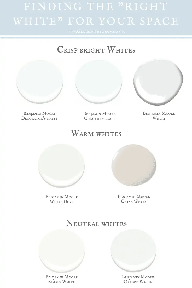
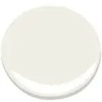
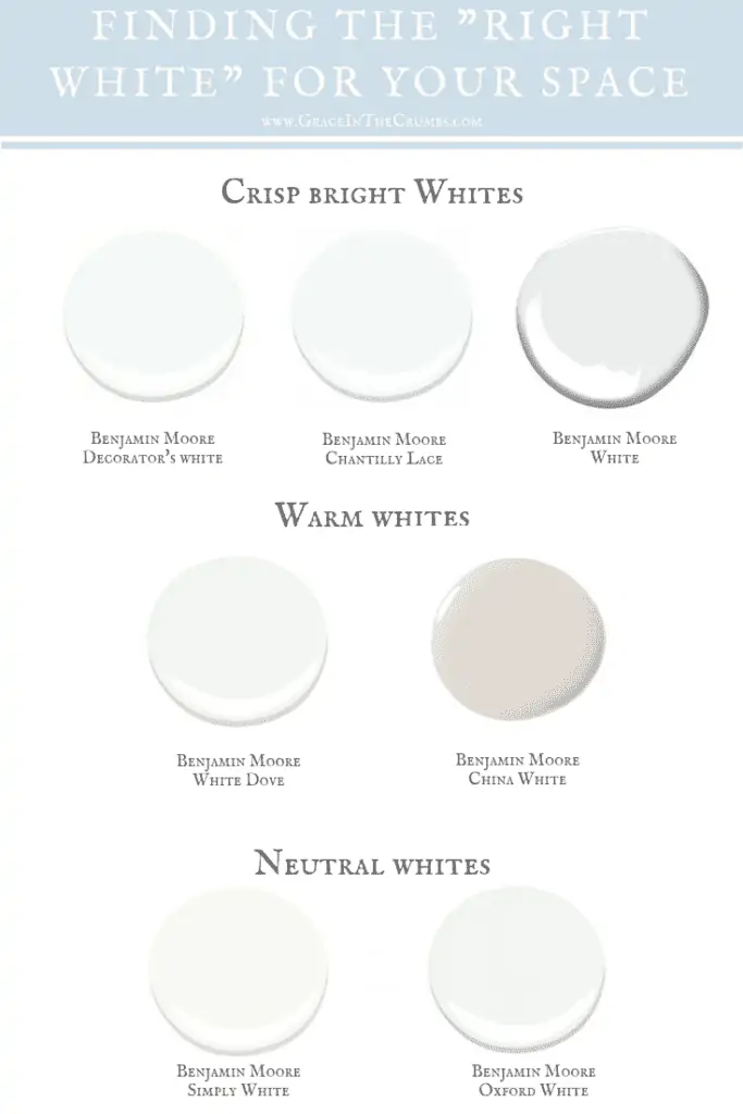
Benjamin Moore, Decorators white
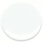
Decorator’s white is a cool crisp white. Great for trim and ceilings. It has a cool undertone and works great with big bold colors. Although decorator’s white is not normally used on “walls”, we used it in our home in Connecticut (both on the trim and the walls) and it looked great. It was bright and cool, which worked great in our new construction home that had a ton of natural light and we wanted to keep airy and modern.
Benjamin Moore, Chantilly Lace
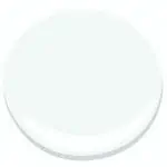
Chantilly lace is another white paint with a cooler undertone. A lot of designers consider it to be their “baseline” white. Everything else is either cool or warm in comparison to Chantilly lace. Chantilly lace is another great one for big open airy spaces. It’s great in kitchens, on trims, ceilings.
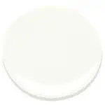
Benjamin Moore, White
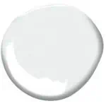
Benjamin Moore considers this paint color to be their true “white”, absent of any cool or warm undertones. It’s a very crisp and bright white. However, it can read “cool” in certain spaces. Another great white for trim, ceilings and cabinetry.
Benjamin Moore, White Dove
Probably one of Benjamin Moore most well-known colors, and a “go-to” color for most decorators, especially in kitchens. It’s a great neutral white, with warm undertones. It’s classic and timeless. When you really aren’t sure what white to use, White Dove can be a great place to start. We used it in one of our kitchens and it looked great. It’s a classic that you won’t regret.
Benjamin Moore, China White
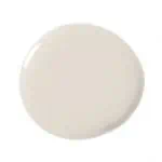
China white is a great traditional, warmer white. It’s great in spaces that you want to feel bright and light, but also a little more traditional. It’s a great wall color paired with White Dove for a classic traditional look. Don’t laugh when you read this, but my mom just used China White in her home and it looks stunning. It’s a great neutral that still feels warm (but not too creamy).
Benjamin Moore, Simply White
Ok, so we are finally to MY FAVORITE white and what we painted our ENTIRE new home. Simply White was the 2016 “Color of the year” (ok, so I may be a few years behind on catching up with the best whites ;)), and for good reason. It’s pretty darn great. Simply white is essentially 50% White Dove and 50% White. So it’s truly the best of both worlds. Just a touch of warm undertone, but with plenty of the bright, crisp, pureness you come to expect with “white”. I am loving the way it looks in our space, and in each of the different rooms which get different amounts of light. It’s a really versatile color. For sure deserving of a “color of the year” award. My new “go-to”.
Benjamin Moore, Oxford White
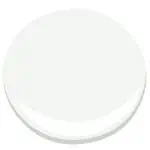
Oxford White is another true white. It has a very small fraction of grey in it, but it’s so minimal that it still reads white. It’s great in a space that you want to read “white” without any warmth.
There are so many nuances when it comes to choosing the right “white” paint for your space. I find that often two colors that look very similar on a swatch, or at the paint store, can look very different on my walls. The true test is really seeing how each of these various shades of white look in your own home. So don’t be afraid to buy a few samples and put them up on your walls. Remember, it’s just paint! So have a little fun with it. Play around and see what “white” you fall in love with.


LEAVE A COMMENT & RATE
Hi Katy,
I would appreciate your recommendation: the trim in my house is China white which I dont want to change. I would like to paint the walls white but am unsure of which white will work with this the existing trim color. I need help. Thank you
Your breakdown of various undertones and finishes is incredibly helpful in navigating the overwhelming array of options out there. It’s fascinating to see how different hues of white can evoke such distinct moods and atmospheres. I appreciate the emphasis on finding the right balance between cool and warm tones to achieve the desired aesthetic. This digest has definitely given me some valuable guidance as I continue my search for the ideal white paint. Great job!
Hi Grace and thank you for helping describe what sometimes feels like a maze of whites! We are redoing our entire exterior and I’ve decided on HC-179 Platinum Gray for the body. I’m really hoping a crisp white trim will work with this …what do you think? Our house is north-facing with lots of great architecutral trim that I want to emhasize…is platinum gray too muddy/earthy to pair with a bright neutral white like Oxford White? I’m stuck! Thanks in advance for any advice
Hi Grace: Love your post on different whites. So helpful with my cabinet dilemma. I just had Polarstone Olympia quartz countertop installed and my BM Swiss Coffee are too creamy against the quartz. The Polarstone Olympia is an off white grayish color with subtle taupe light gray veins. The backsplash is the same quartz. I’m resigned to painting the cabinets and I’m torn between White Dove and Simply White. I have one north facing window so not much natural light. I know I need a warmer white but want to avoid creamy. I’m trying to transition out of the Tuscan Era. Any suggestions would be greatly appreciated! Thanks. Leslie 😩
Hi Grace,
Wow! your blog is fascinating and so helpful to me. I really like how you explained how to use these whites and what effects you get with each. I have a small mobile home that faces north. I have lots of light with a skylight in my small kitchen. I’ve chosen to go with Simply White for the walls throughout my house too. My color scheme is 60% white, 30% blue teal, 10% green. I’m going to paint the bottom half of my cupboards teal and the top cupboards will be white. Whiter than the walls but I have no idea what color white to choose for the top cupboards. Any suggestions would most certainly be welcome. Thank you Grace. Just so you know, I’ve spent quite some time on researching paints and by far, yours has been (without a doubt) the most helpful! ~ Diane
Hi Grace,
Wow! your blog is fascinating and so helpful to me. I really like how you explained how to use these whites and what effects you get with each. I have a small mobile home that faces north. I have lots of light with a skylight in my small kitchen. I’ve chosen to go with Simply White for the walls throughout my house too. My color scheme is 60% white, 30% blue teal, 10% green. I’m going to paint the bottom half of my cupboards teal and the top cupboards will be white. White than the walls but I have no idea what color white to choose for the top cupboards. Any suggestions would most certainly be welcome. Thank you Grace. Just so you know, I’ve spent quite some time on researching paints and by far, yours has been (without a doubt) the most helpful! ~ Diane
Hi Grace,
Wow! your blog is fascinating and so helpful to me. I really like how you explained how to use these whites and what effects you get with each. I have a small home that I want to cheer up a little so I’m going to go with Simply White. But now I’m feeling stuck on what color to paint my kitchen cabinets? Do the kitchen cabinets have to be the same color as the baseboards and molding? I am thinking of painting those whiter. I welcome your suggestions please? Mine
Hi Grace,
Wow! your blog is fascinating and so helpful to me. I really like how you explained how to use these whites and what effects you get with each. I have a small home that I want to cheer up a little so I’m going to go with Simply White. But now I’m feeling stuck on what color to paint my kitchen cabinets? Do the kitchen cabinets have to be the same color as the baseboards and molding? I am thinking of painting those whiter. I welcome your suggestions please?
Help I am down sizing to a 1350 sq ft condo . I have a lovely taupe fabric sectional and upolstered dining chairs with a glass pedestal table , southern exposure very bright . I like simple and timeless . Floors are a light ivory large tile . Don’t know what Benjamin Moore paint to use .
Hi! Love this blog post – very helpful! Our house faces south/west and therefore gets a lot of sunlight throughout the day. We just redid our red oak floors in special walnut … not too dark, transitional color. I am thinking of painting the walls BW Balboa mist … in our living room (which gets the most light) it gives a slight green undertone in the mornings. I havent decided on the trims/doors/kitchen cabinets yet … any thought on what you think might look good? I want something neutral … not too stark white. I was thinking simply white but I am afraid it will give out those yellow undertones. Maybe oxford white? Appreciate your help!
I would 100% go with simply white. You will not get yellow undertones. It’s great. Our whole house is simply white and it’s very neutral (not cool or warm). It feels modern, but not “cold”. It’s my go-to for white. Anything more like “white dove” and you’ll get those cream/yellow undertones, but I think you’ll be really happy with simply white. Hope that helps. And don’t forget – have FUN!! Enjoy this exciting time. You’re creating a home and there is nothing more special. xoxo
I’m struggling so much to choose the right colour for my living room/kitchen/dining. We have southwest facing windows with lots of light.
I like to stay away from any yellow undertones. I do not want anything beige either.
The trim is panted BM hazy skies, not to much a fan of but will not be changing. The walls were painted dark prior and would like to keep things bright and cheery. I have a lot of blue/teal accents.
Hey Deanna. So if you’re sticking with the current trim color (Hazy skies), I would suggest going with either White Dove (which is a little creamier) or simply white. Both will really help brighten up your space, without any yellow undertones – but still work with your trim. Hope that helps!
Thank you so much. I will definitely check these out. Much appreciated!
Have you had any issues with Simply White reflecting a yellow tone, especially in artificial light? We used it in our last house and I didn’t like the yellow hue our walls took on at night. We’re building another house and I’m trying to decide if I want to try Simply White again or something else this time.
It’s funny that you say that, Carissa, because I was nervous about the same thing. I really did NOT want to use simply white. It felt too yellow to me in comparison to other whites. However, I will say, that it is lovely in our home now. We have it on all of our walls, cabinets and it does not pull yellow/cream at all (including in artificial light), but I could see how in some spaces it could. We have a lot of natural light in our home, so I think that’s why it works. Your new home may feel very different than your space now, so I’d say it’s definitely worth putting a sample up. But oxford white (or even just “white” by BM) could be a good option too. Hope that helps and contras on the new home!
Hi there –
Loved this blog post. I’m currently in the process of narrowing down whites. I love Oxford white for the walls/trim but am torn about what white to do for the cabinets/trim around window (they’re currently cherry wood that we are painting white) the backsplash and counters are black granite.
Thanks!
Hey there, Monique. Thanks for your message. Oxford white will be beautiful on the walls and trim. So classic. I guess it depends on what type of look you want with your cabinets (trying to bring in more warmth or cooler tones) – but just guessing based on what you’ve said, I think Simply white would be a safe bet. Simply white is so neutral and is GORGEOUS on cabinets and would just blend well with the oxford white. But in all honestly – you could easily do the cabinets the same color as your walls. We did that in our home and I love it. All of the cabinets/built-ins/trim is the same color (simply white) and it just gives a more modern fresh feel. Hope that helped and best of luck! I’m sure it will be beautiful. xoxo
Good evening. We have black granite (ukatuba) and beige floors. We are looking to paint our cupboards white but do not know enough about tones. North exposure.
Hey there, Lisa. I’d suggest starting with White Dove since you have beige floors and darker counters….I think that might be a softer contrast and blend well with the beige. Good luck! I’m sure it will be gorgeous!
Hi. I need to find a white trim paint for my front hall and main hallway. My walls are Benjamin Moore HC-48 Bradstreet Beige. I tried White Dove and it falls flat. I’m not sure what white to use. My house is very traditional and I have hardwood floors stained “rosewood “throughout on my main floor.
Thank you for any help
I would give Simply White a try. It’s a little brighter of a white than White Dove, but still really traditional (and not too cool). I think it might give you more of the “pop” you’re looking for. Good luck, Cindy!
Hi Grace! I really enjoyed reading this blog post! We are in the process of painting our house and we are completely torn! The bottom half of our house is white washed stone (varying colors of gray and beige) and our roof is dark gray. We plan on painting the window sashes and mullions in BM Iron Mountain and the shutters in BM Coventry Gray. We have no idea whether to do the siding in BM White Heron, White Dove or Simply White. The house is North facing. Would love and appreciate your thoughts! The primer is already on and we are more confused than ever!
Hey there, Felicia! I totally feel you with being confused. Painting your home can be really stressful and overwhelming….there are soo many options when it comes to white paint. All of your choices sound beautiful. I LOVE Coventry Gray by the way – the shutters will look great. I’d probably suggest going with White Dove. I think simply white could be too stark. Although I love it on our interior walls…I think it could be too stark on your exterior. White Dove is just a little “softer” and I think it will look gorgeous with Coventry Gray. White Heron is gorgeous as well – I think you could honestly do either of those two and be happy. Keep me posted on what you pick!
Loved finding this what a gift……..
Was going between whisper and simply white. They are very close to each other!
I want a crisp white for a beach house but not too sterile!
Hi Grace. Thanks for sharing your blog. I have a house that faces north and also has a dark gray roof and some creamy and rusty colored flagstone on the exterior front wall that comes up 4 feet off the ground.
I’d really like to paint the entire in a soft neutral white I think I’ve narrowed it down to
Benjamin Moore’s Simply White, White Heron or White Dove. I have 2 ft. paint samples of each color on the west side of my home. I look at it at various points throughout the day and I’m still torn! I even painted small samples of each color right above one wall up front and it’s a tough call. I can email you pictures if you’d like. Please let me know your thoughts. Thanks again!
R/
Don
Hey Don,
Wow, that sounds like you’ve narrowed it down to three great options. And honestly, I’m sure all of them would work. Sometimes it really comes down to personal preference and trusting your gut. When in doubt though, I feel like you can ever go wrong with White Dove. It’s really classic and beautiful and goes with everything. I hope that helped!
Thanks for the response. I have narrowed down to Simply White and White Dove!
Don
Hi grace;
I have to stay I am really happy to find your blog as I like how you explain about all these different white colors. We are moving to this small house with west (living room) and east (kitchen) windows with open concept between the two rooms. I don’t like dark rooms I actually need to have light and openness so originally i was going with baby’s breath (benjamin moore) for walls and ceilings and chantilly lace for doors and trims but after reading your blog I am not sure anymore!
I have white cabinets with white countertops + dark grey island in the kitchen and in my living room I have a large persian rug with red and blue colors with cream color sofas.
Now i am thinking maybe i should use simply white for the walls and ceilings but don’t know what i should use for the doors and trims , any ideas? should i use chantilly lace with simply white? Also I have tried few white colors in my living room and they looked greenish and i really don’t like that!
So sorry for this long Comment, I just hope maybe you can help me out.
Thank you,
Hi Lili! No apologies at all! Love comments like this. You could go in a few directions, but it’s hard to know without seeing your space. Every space is so unique with what’s going on with the lighting, and how the other furniture/floor coloring makes white paint read differently. White Dove is a classic for doors/trim and a good “warm neutral” (but not too warm). I personally prefer simply white (which is a shade more neutral than WD), and it’s what we used for our trim, ceiling, and walls. Either way – I do like my walls/trim the same, but it’s such a personal preference. Either way, my advice would be to trust your gut and go with your first instinct. I hope that helped!